

Create Reusable Confirmation Dialogs with Angular Material
In this post, I'll show you how to create reusable confirmation dialogs, using Angular services and the Material Dialog component.
Video tutorial
If you like videos, follow along on my YouTube channel. Otherwise, just continue below :)
Confirmation dialogs are great tools to use when you want to make sure the user really wants to do something in your web app. The Angular Material Dialog component seems to be perfect for this purpose.
But if your app is even moderately complex, you'll need several prompt dialogs at different places - perhaps with different captions and messages. That means more components to create and more code.
Why not make a reusable dialog component which can be configured to show your message at runtime?
Here's what we'll be building in this post.
We have a dialog with Yes/No prompt for some purpose and two more for different cases. All by using the same component code!
Let's get started then!
In case you're interested, check out a previous article on adding a dark mode to your Angular app in three steps here.
Setting up the project
First, we've created a new project with Angular 11 and added the Angular Material library to it.
ng new angular-confirm-dialog
ng add @angular/material
Then, we'll quickly import our material components - the Button, Dialog, Icon and the Toolbar Module in our app module file.
import { NgModule } from "@angular/core";
import { BrowserModule } from "@angular/platform-browser";

import { AppComponent } from "./app.component";
import { BrowserAnimationsModule } from "@angular/platform-browser/animations";
import { MatDialogModule } from "@angular/material/dialog";
import { MatIconModule } from "@angular/material/icon";
import { MatButtonModule } from "@angular/material/button";
import { MatToolbarModule } from "@angular/material/toolbar";

@NgModule({
  declarations: [AppComponent],
  imports: [
    BrowserModule,
    BrowserAnimationsModule,
    MatDialogModule,
    MatIconModule,
    MatButtonModule,
    MatToolbarModule,
  ],
  providers: [],
  bootstrap: [AppComponent],
})
export class AppModule {}
Great we're all setup to create our component.
Adding a dialog service to the app
Let's first create a dialog service to encapsulate opening of the confirmation dialog. We can then use this service whenever we need to show a dialog. We'll use the following command on the Angular CLI.
ng generate service services/dialog
Next, we'll create the dialog component itself using the following command. We'll store all our dialogs in the dialogs subfolder.
ng generate component dialogs/confirm
Setting up the dialog layout
Before making it configurable, let's create the layout for our dialog. So we'll go in our component template and start adding our layout.
<div class="header">
  <h2 mat-dialog-title>Title</h2>
  <button mat-icon-button [mat-dialog-close]="false">
    <mat-icon>close</mat-icon>
  </button>
</div>
First, we've added a header with a title and a close button.
Next, we add some styles to make it a flex row and use justify content space-between to align the title and close button properly.
.header {
  display: flex;
  justify-content: space-between;
  align-items: center;
}
The Material Dialog Module provides us with some readymade directives. One of them is [mat-dialog-close], this simply dismisses the dialog with the value we provide. So for the close icon button, we'll just write [mat-dialog-close] and give value of false. This means the user has cancelled the dialog.
Great, no need to add an event handler!
We'll also add the mat-dialog-header directive to the title element, so that it adds the necessary formatting.
Next, let's move on to the content. We have a simple div with mat-dialog-content as the directive. This adds the styling for the content and we just need to specify a message here. Let's call this "Are you sure you want to do this?"
<div mat-dialog-content>Are you sure you want to do this?</div>
Then, we need the prompt action buttons. For that, Angular Material provides us with mat-dialog-actions. Let's add two buttons inside of it, one will be No, other will be Yes. For the confirmation button, we'll make the color of the button primary, so that it is more noticeable for the user.
Keeping important buttons prominent is better from a UX point of view! It draws your users attention to the actions you want.
We'll also add align=end to our actions row so that the buttons are right aligned. For the cancel button, we'll use mat-dialog-close with false as with the close. But for the confirm button, we'll add mat-dialog-close with true, so that the caller of the dialog can know the user agreed to this and proceed accordingly.
<div mat-dialog-actions [align]="'end'">
  <button mat-raised-button [mat-dialog-close]="false">No</button>
  <button mat-raised-button color="primary" [mat-dialog-close]="true">
    Yes
  </button>
</div>
Great, we have our template setup.
Setting up the service for a quick test
Now let's add some code to our service. Let's add a function called confirmDialog. We'll add the MatDialog service in our constructor here and use the open function.
export class DialogService {
  constructor(private dialog: MatDialog) {}

  confirmDialog(): {
    this.dialog
      .open(ConfirmComponent);
  }
}
Let's also quickly add a button to test this in our app.component.html. We'll add a handler and include our dialog service in the component. Then we'll simply call our new function in the handler.
export class AppComponent {
  constructor(private dialogService: DialogService) {}

  openDialog() {
    this.dialogService.confirmDialog();
  }
}
Great, time for some testing! Let's do ng serve and see what we've got!
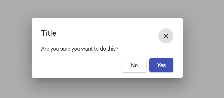
So when we click on Open Dialog, it shows us our basic confirmation dialog, as expected.
Making a reusable, configurable dialog
This is great, but remember we want to make this dialog configurable and reusable - so we can use it in all of the places where we need some sort of confirmation.
So to make this configurable, we need to send in some parameters to the dialog. Let's define these parameters in the form of an interface called ConfirmDialogData. We'll create a models folder and add a file to it called confirm-dialog-data.
export interface ConfirmDialogData {
  title: string;
  message: string;
  confirmText: string;
  cancelText: string;
}
We added a title (which will be a string), a message, confirmText and a cancelText. The last two are captions for our two buttons.
Let's allow our dialog component to accept this data. To do that, we'll just add an Inject decorator with MAT_DIALOG_DATA and specify the type to be the one we defined.
export class ConfirmComponent implements OnInit {
  constructor(@Inject(MAT_DIALOG_DATA) public data: ConfirmDialogData) {}
}
Then all we have to do, is replace our hardcoded text in the dialog with our parameters in the data.
<div class="header">
  <h2 mat-dialog-title>{{data?.title}}</h2>
  <button mat-icon-button [mat-dialog-close]="false">
    <mat-icon>close</mat-icon>
  </button>
</div>

<div mat-dialog-content>{{data?.message}}</div>

...buttons code as above
How do we pass in the data to the dialog? We just add a parameter to our function in the service and pass in the same in our open function.
confirmDialog(data: ConfirmDialogData): Observable<boolean> {
    return this.dialog
      .open(ConfirmComponent, {
        data,
        width: '400px',
        disableClose: true,
      })
      .afterClosed();
  }
We also passed in a width so that all our angular material confirmation dialogs are consistent. Also, we want disable close on clicking of the background, since that can be irritating for the user. We want the user to explicitly cancel or close the dialog.
One last thing, we'd also like the caller of the confirmation to receive some response about whether the user confirmed the action or not. To do that we added a return type of Observable with a boolean. And return the afterClosed() function of the dialog reference.
In the main component, we can check to see what the response was by subscribing to our service function.
Great, so I think we're all set up with a configurable, reusable confirmation dialog. Let's add a few buttons and test out three different confirmation boxes - but using the same confirm component.
<button mat-raised-button (click)="yesNoDialog()">Open Yes/No</button>

<button mat-raised-button (click)="confirmCancel()">Open Confirm/Cancel</button>

<button mat-raised-button (click)="yesNotSure()">Open Yes/I'm not sure</button>
And its corresponding component code.
yesNoDialog() {
    this.dialogService.confirmDialog({
      title: 'Title',
      message: 'Are you sure you want to do this?',
      confirmText: 'Yes',
      cancelText: 'No',
    });
  }

  confirmCancel() {
    this.dialogService.confirmDialog({
      title: 'Please confirm action',
      message: 'Please confirm whether you want to do this!',
      confirmText: 'Confirm',
      cancelText: 'Cancel',
    });
  }

  yesNotSure() {
    this.dialogService.confirmDialog({
      title: 'Are you sure?',
      message: 'Are you sure you want to do this?',
      confirmText: 'Yes',
      cancelText: 'Not sure!',
    });
  }
And the result?
Conclusion
So there you have it! Simple and easy, reusable confirmation dialogs using Angular Material which you can use throughout your app and save a lot of code and headache later!
In a small app, you'll probably not notice much. But in a large app, this can save significant code and maintenance later when for instance, you need to change the layout of the dialog.
I hope this helps someone, somewhere in creating better Angular apps!
The code for this tutorial can be found at this github repository.
Thanks for reading! Bye :)
Check out my Angular and Firebase Authentication crash course

Use Angular 16, Angular Material and Firebase Authentication, Firestore and Storage to create a complete Sign Up App!
You may also like...


Learn Angular and Firebase!
Use Angular 16, Angular Material and Firebase Authentication, Firestore and Storage to create a complete Sign Up App!