
Create a Simple Contacts App with Angular Signals (2/2)
Let's continue with our Angular Signals introduction by building a simple contacts app.
Recap
In an earlier post, we created our first Angular Signal and used it to show our contacts list with the Angular Material list component. Let's continue on the same app and add the remaining functionality!
So let's get started.
Creating the toolbar add button
We'll start by adding the add button on the toolbar - so that our users can navigate to the add route and component. So let's add the following in our app.component.ts file.
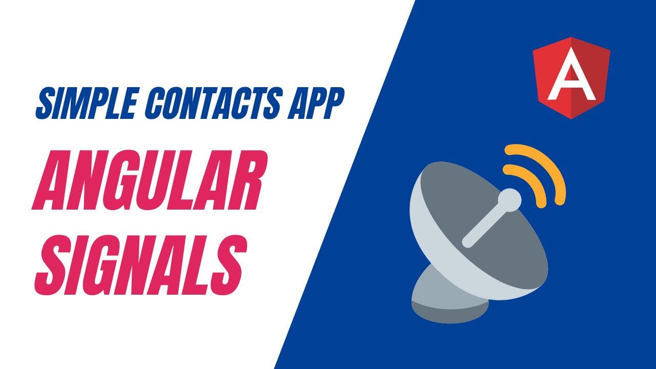
<mat-toolbar color="primary">
  My Contacts ({{ totalContacts() }})

  <button mat-icon-button routerLink="/add">
    <mat-icon>add_circle</mat-icon>
  </button>
</mat-toolbar>
Note we also added a routerLink to navigate the user to the add route. Be sure to include the related material modules in our imports as well.
@Component({
  selector: 'app-root',
  standalone: true,
  imports: [
    CommonModule,
    RouterOutlet,
    MatToolbarModule,
    MatButtonModule,
    MatIconModule,
    RouterModule
  ],
Also, we'd like to add a bit of styling to the toolbar, so that the add button appears on the far right of it - instead of near the title. So let's add the justify-content property for the mat-toolbar in our styles array in the same file.
mat-toolbar {
  justify-content: space-between;
}
Great, let's test this out.
The button looks good and once you click on it, you'll be able to see the empty add-contact component.
Building the Add Contact UI
Let's now build up the Add Contact UI using material form fields. We'll add the following template code to the add-contact.component.ts file.
First, we'll include our required modules in the imports of the component.
@Component({
  selector: 'app-add-contact',
  standalone: true,
  imports: [
    CommonModule,
    FormsModule,
    MatFormFieldModule,
    MatInputModule,
    MatButtonModule,
    RouterModule
  ],
Then, we'll add the template for the add contact UI.
<div class="container">
  <h2>Add Contact</h2>
  <div class="fields">
    <mat-form-field>
      <input [(ngModel)]="name" placeholder="Name" matInput />
    </mat-form-field>
    <mat-form-field>
      <input [(ngModel)]="email" placeholder="Email" matInput />
    </mat-form-field>
    <mat-form-field>
      <input [(ngModel)]="phone" placeholder="Phone" matInput />
    </mat-form-field>
  </div>
  <div class="actions">
    <button mat-raised-button color="primary" (click)="save()">Save</button>
    <button mat-raised-button routerLink="/">Back</button>
  </div>
</div>
So what have we done here? Let's go over it step by step.
We've first added a container div, so that we can add some padding to the content. Then, after adding a title, we add the form fields for our contacts data items - name, phone and email.
We've used the ngModel directive to create two-way data binding between the inputs and the variables in our component (we'll add these in a bit).
And lastly, we added an actions div and some material buttons within it to save the new contact and go back to the list.
We also need to add the field variables as follows.
export class AddContactComponent {
  name = "";
  email = "";
  phone = "";
}
Great! One last thing, we need to do is to add the styles in our styles array so that our layout looks good.
.container {
  padding: 24px;
}

.fields {
  display: grid;
  grid-template-columns: repeat(2, 1fr);
  gap: 8px;
}

.actions {
  display: flex;
  gap: 8px;
}
We've made the fields into a 2 column grid using a CSS grid and the actions into a flex row with a slight gap.
When we test now, we should be able to see the following add contact layout.
Great, looking good! Let's move on now to actually adding the functionality to add a new contact.
Adding functionality in the Contacts Service
To do that, we'll add the following function in the contacts.service.ts file.
router = inject(Router);

addContact(newContact: Contact) {
  setTimeout(() => {
    this.contacts.update((contacts) => [newContact, ...contacts]);
    this.router.navigate(['/']);
  }, 2000);
}
Our addContact function takes in the new contact object as an argument. We've used a timeout here so that we can mimic a real API call - which can take a moment to complete. You can skip it if you need.
Then, we actually update our signal to add the new contact. Now the basic API method to change a signal is the set() function. But there is also an update() function, which is a convenience function for when you want to update a signal.
Here we're simply defining a new contacts array - and appending the new contact at the top. The callback inside of the update basically provides you with the current value of the signal.
Right after adding the contact, we use the router to navigate back to our contacts list.
Great! So the last thing to get this working is to just bind the save button with this addContact function. So let's do that now in the add-contact.component.ts file.
contactsService = inject(ContactsService);

save() {
  this.contactsService.addContact({
    name: this.name,
    email: this.email,
    phone: this.phone,
  });
}
Ok, let's test this out now and try adding a new contact. When we click on save after adding the fields, we'll be able to see our new contact right at the top of our contacts list.
This happens because our contacts signal's value changes when we call the update function. Angular then notifies all of its consumers which includes our contacts list template - which then updates itself!
Great!
Adding the Delete Contact button
Let's now move on to adding the delete contact functionality. We'll first add the delete icon button in the contacts list - alongside each contact list item.
<mat-list-item *ngFor="let contact of contacts()">
  ...
  <button
    matListItemMeta
    mat-icon-button
    (click)="contactsService.deleteContact(contact.email)"
  >
    <mat-icon>delete</mat-icon>
  </button>
</mat-list-item>
Note how we're using the matListItemMeta directive provided by the material components. This causes the delete icon button to be aligned at the very end of the list item row - as recommended by material design specifications.
In the code, we're calling our service's deleteContact function with the contact's email address as argument.
Next, we need to fill in the blanks and add the deleteContact function in our contacts service!
deleteContact(email: string) {
  setTimeout(() => {
    this.contacts.update((contacts) =>
      contacts.filter((c) => c.email !== email)
    );
  }, 2000);
}
As before, we're using the update() function for the contacts signal and then using the filter array function to remove the contact with the email given. This returns a new array with the given contact not included - thus effectively deleting it.
Great, once you test this out, you'll see your contacts list UI getting updated as soon as you delete a contact!
Adding our first computed
We've now seen how we can create and update Angular Signals and use them to make our UI reactive. Let's now add our first computed to the app!
So if you recall, computed is a read-only signal which is derived from other signals. In our app's context, we'd like to show the total contacts in the list right besides the title in the toolbar.
Let's create a computed in the contacts.service.ts - so that we can use it anywhere.
totalContacts = computed(() => this.contacts().length);
Pretty simple, right? We access the contacts signal's value in the same way as we did in other places by simply calling it as a function and then get its length.
Now let's show this computed's value in our toolbar in app.component.ts. First, we inject the service in our component.
contactsService = inject(ContactsService);
totalContacts = this.contactsService.totalContacts;
Then, we get the signal's value in our template as follows.
<mat-toolbar color="primary">
  My Contacts ({{ totalContacts() }}) ...
</mat-toolbar>
Great, now when we test it out, we can see the number of contacts in the toolbar.

To truly see its power, just add or delete a contact in the list and you'll see the total contacts update automatically. If we weren't using signals or computed, we'd have had to update the count manually whenever we changed the list!
Adding an effect to our app
Great, so we've seen how computeds work. Let's also add an effect - which is the third primitive introduced by the Angular team.
Just to recap, effects are functions which are executed whenever any of their dependent signals are changed.
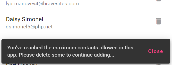
In our app's case, let's suppose we have a maximum limit to the number of contacts that can be added. And when the limit is reached, we'd like to show a notification to the user using the Angular Material Snackbar. This ia good use case for an effect.
So first, we'll add another computed to our contacts service called maxReached.
readonly MAX_CONTACTS_ALLOWED = 21;

totalContacts = computed(() => this.contacts().length);

maxReached = computed(
  () => this.totalContacts() >= this.MAX_CONTACTS_ALLOWED
);
The maxReached computed will return a boolean value and tell us whether the maximum contacts allowed has been reached or not.
Let's use this computed to create an effect in our app.component.ts.
contactsService = inject(ContactsService);

totalContacts = this.contactsService.totalContacts;
maxReached = this.contactsService.maxReached;

snackbar = inject(MatSnackBar);

constructor() {
  effect(() => {
    if (this.maxReached()) {
      this.snackbar.open(
        "You've reached the maximum contacts allowed in this app. Please delete some to continue adding...",
        'Close'
      );
    }
  });
}
An effect can only be created inside of a constructor as you can see above. Here we're simply checking our maxReached signal's value - and if it's true, we show a snackbar.
Above this, we've also injected the MatSnackBar and also imported MatSnackBarModule in our imports.
Great, let's test this out now!
So now when we add a new contact and as soon as the count reaches 21, the snackbar shows up. Our effect works!
You can also add a nice touch to the UI and disable the add button when the maximum has been reached. All you've to do for that is to modify the button as follows.
<mat-toolbar color="primary">
  ...
  <button mat-icon-button routerLink="/add" [disabled]="maxReached()">
    <mat-icon>add_circle</mat-icon>
  </button>
</mat-toolbar>
Now the button will be enabled and disabled automatically as the maxReached computed changes its value!
Conclusion
In this two part series, we created a simple contacts app using the new Angular Signals API. It was meant to be a good practical introduction to see how to work with signals as it is a new concept for most developers.
We can build upon this example contacts application to add real network calls and such, but I'll leave that upto you. I hope you liked this demo of how Angular Signals work and the reactivity they bring to your apps.
In future versions, expect more signal-based implementations in Angular - so that we can fully utilize the fine grained reactivity that they bring to Angular.
Till then, have fun!
You can find the complete source code for this app at this github repo.
Thanks for reading. Bye :)
Check out my Angular and Firebase Authentication crash course

Use Angular 16, Angular Material and Firebase Authentication, Firestore and Storage to create a complete Sign Up App!
You may also like...


Learn Angular and Firebase!
Use Angular 16, Angular Material and Firebase Authentication, Firestore and Storage to create a complete Sign Up App!