Create a responsive card grid in Angular using Flex Layout
If you're developing a web app in the year 2023, then it is expected that you'll be handling the layout for different screen sizes. Most of your users will probably be on their mobile devices! Angular Flex Layout is a great tool in your hands - to make sure your layouts work well on all devices.
Video tutorial
In the front-end development world, you call this "responsive" design. In other words, your layout "responds" to changes in your screen sizes and adjusts dynamically based on the users' device. Pretty cool, huh?
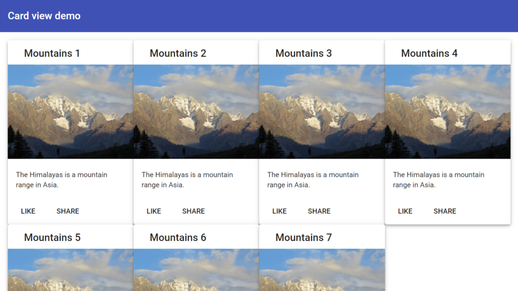
In this article, I'll be covering one way to quickly come up with a responsive card grid layout in Angular 9. We will be doing this using the intuitive flex layout library. Here is the end result:
Responsive card grid using flex layout
Note: You can achieve the same results with good old CSS as well. But you'll find flex layout much simpler in terms of syntax and quicker. If you're coming up with prototypes, this makes a lot of sense.
Update for 2023:
@angular/flex-layoutpackage is now deprecated, so please check out my 2023 version of this blog, where I create a similar responsive card grid, but by using only CSS! Click here to go to the new post
Setting up the project
So let's setup the project for this quickly. Run the following commands in your terminal/console to create a new Angular project (choose any settings from the prompts):
ng new card-view-demo
Then, add angular material library - from which we're going to pick up our card component. Again, choose any setting from the prompts.
ng add @angular/material
Lastly, let's add the flex layout library as a dependency.
npm install -s @angular/flex-layout
Next, we need to import the Angular Material card module and flex layout module in our app.module file - so it can be used in our template file (app.component.html). I've also added the material button and toolbar for making the look a bit complete.
import { BrowserModule } from "@angular/platform-browser";
import { NgModule } from "@angular/core";

import { AppRoutingModule } from "./app-routing.module";
import { AppComponent } from "./app.component";
import { BrowserAnimationsModule } from "@angular/platform-browser/animations";
import { MatCardModule } from "@angular/material/card";
import { MatToolbarModule } from "@angular/material/toolbar";
import { MatButtonModule } from "@angular/material/button";
import { FlexLayoutModule } from "@angular/flex-layout";

@NgModule({
  declarations: [AppComponent],
  imports: [
    BrowserModule,
    AppRoutingModule,
    BrowserAnimationsModule,
    MatCardModule,
    MatToolbarModule,
    MatButtonModule,
    FlexLayoutModule,
  ],
  providers: [],
  bootstrap: [AppComponent],
})
export class AppModule {}
Adding an Angular Material Card
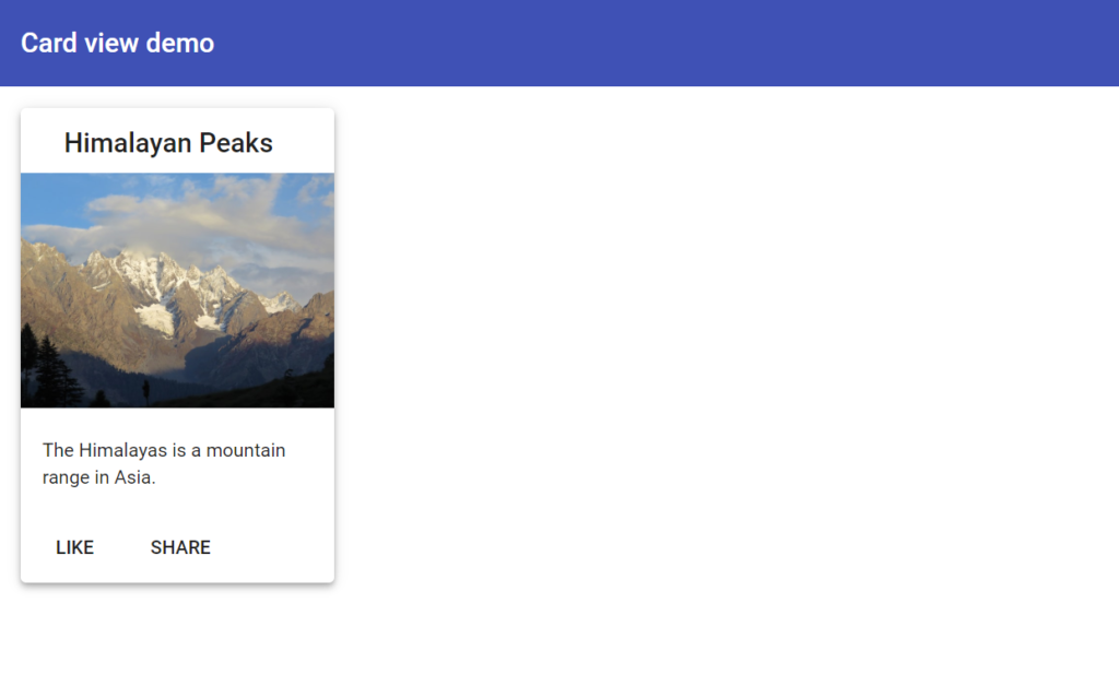
Let's now create a basic Angular Material card with some content in it. It's simple enough and I've used the example given on material components official docs. Here is my version with some changes (app.component.html).
<mat-toolbar color="primary"> Card view demo </mat-toolbar>
<div class="content">
  <mat-card class="mat-elevation-z4">
    <mat-card-header>
      <mat-card-title>Himalayan Peaks</mat-card-title>
    </mat-card-header>
    <img
      mat-card-image
      src="./../assets//assets/blog/create-a-responsive-card-grid-in-angular-using-flex-layout-part-1/mountains.jpg"
    />
    <mat-card-content>
      <p>The Himalayas is a mountain range in Asia.</p>
    </mat-card-content>
    <mat-card-actions>
      <button mat-button>LIKE</button>
      <button mat-button>SHARE</button>
    </mat-card-actions>
  </mat-card>
</div>
We've used a simple toolbar - with the primary color. Then we've used the components and directives provided by the material card module to layout our content. We've also added some styling in our app.component.scss and a mat-elevation class to the card to make the cards a bit more elevated!
.content {
  padding: 16px;
}

.content > mat-card {
  width: 200px;
}
I've used my own photo of Pakistan's northern areas as the card's main image. You can use any yourself - just copy it in the assets/images folder and modify the img src link accordingly.
If you run ng serve now though, you'll see a fixed width angular material card with suitable outside padding.
Nice! Although we want more of a card grid layout, rather than a single card and also a grid which is responsive i.e. adjusts itself to varying screen sizes. Let's go ahead and add the magic of flex layout to our cards.
Give me a row of cards!
Angular Flex layout provides us simple directives which we can apply to our containers and elements in the template to convert them into flexible containers. Two of the most important ones are fxLayout and fxFlex.
fxLayout is used to specify whether flex layout should be used on the container. Most commonly it can set to either row or column - depending on how you want to layout your nested elements inside it.
fxFlex is used to mark nested elements with the required widths and flexbox parameters. We can specify pixel widths, percentage widths or even css calc expressions. The syntax is very close to how flexbox works in css.
Let's go ahead and add these two for our card grid.
<div class="content">
<div fxLayout="row wrap">
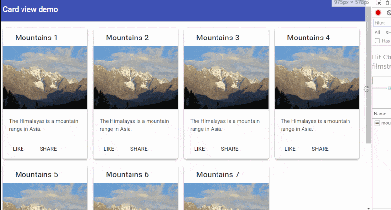
<div fxFlex="25%" *ngFor="let num of [1,2,3,4,5,6,7]">
<mat-card class="mat-elevation-z4">
<mat-card-header>
<mat-card-title>Mountains {{num}}</mat-card-title>
</mat-card-header>
<img
mat-card-image
src="./../assets//assets/blog/create-a-responsive-card-grid-in-angular-using-flex-layout-part-1/mountains.jpg"
/>
<mat-card-content>
<p>The Himalayas is a mountain range in Asia.</p>
</mat-card-content>
<mat-card-actions>
<button mat-button>LIKE</button>
<button mat-button>SHARE</button>
</mat-card-actions>
</mat-card>
</div>
</div>
</div>
We've added an *ngFor directive on a containing div to duplicate the single card into multiple with different numbers. Then, we've set fxLayout to row wrap and fxFlex to 25% (so that we get four cards in a row). Also, we removed the fixed width for the card, since we'll now be setting the width through the fxFlex directive.
Add some spacing to the card grid
One obvious problem: We need some spacing! Let's use fxLayoutGap directive for this purpose and add it to the parent container.
<div fxLayout="row wrap" fxLayoutGap="16px"></div>
Once we add it though, we see only three cards can be accommodated in a row (though we want four). This is because the spacing increased the total width of the rows to more than 100%.
Angular Flex layout provides a neat little trick to resolve this issue. We just need to add grid to our fxLayoutGap directive to tell flex layout this gap is meant for a grid with gutter.
<div fxLayout="row wrap" fxLayoutGap="16px grid">...</div>
Under the hood, the grid directive actually applies a reverse negative margin on the container and for spacing between cards, adds some padding. This is why we have an enclosing div for the mat-card component, otherwise the padding will apply to the mat-card element itself instead of outside it.
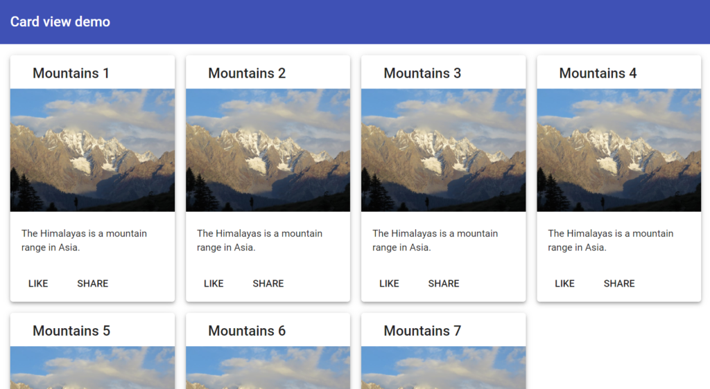
So far, so good. We now have a pretty decent looking material card grid for our app!
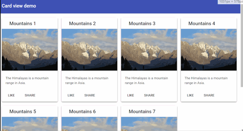
However, if you open up your Developer console (F12 on Windows) and resize the screen, you'll see that it's not very responsive.
As you reduce the screen size, the cards reduce their width instead of their number and appear squeezed, not wrapping to the next line. This is not what we're looking for at all!
What we need is for the number of cards to reduce as the screen size changes. On mobile sizes (the narrowest), there should only be one card per row, since there isn't much space to accommodate more than that.
Making a responsive card grid
In order to add responsive behavior to our card grid layout, we'll use flex layout's responsive notation. This can be added as a suffix to any directive. In our case, we just need to append the breakpoint to our fxFlex directive and then specify the behavior we want at that breakpoint.
Already predefined breakpoints are xs, sm, md, lg. Xs is used for mobile screen sizes, sm for close to tablet size screens and md, lg for desktop.
For more details about which screen sizes each breakpoint corresponds to refer to this link.
For example, fxFlex will represent the default flex value, fxFlex.xs will represent the flex value (width) for mobile screens, fxFlex.sm will represent the value for tablet screens etc. Simple enough? Let's see some code!
<div class="content">
  <div fxLayout="row wrap" fxLayoutGap="16px grid">
    <div
      fxFlex="25%"
      fxFlex.xs="100%"
      fxFlex.sm="33%"
      *ngFor="let num of [1,2,3,4,5,6,7]"
    >
      <mat-card class="mat-elevation-z4">
        <mat-card-header>
          <mat-card-title>Mountains {{num}}</mat-card-title>
        </mat-card-header>
        <img
          mat-card-image
          src="./../assets//assets/blog/create-a-responsive-card-grid-in-angular-using-flex-layout-part-1/mountains.jpg"
        />
        <mat-card-content>
          <p>The Himalayas is a mountain range in Asia.</p>
        </mat-card-content>
        <mat-card-actions>
          <button mat-button>LIKE</button>
          <button mat-button>SHARE</button>
        </mat-card-actions>
      </mat-card>
    </div>
  </div>
</div>
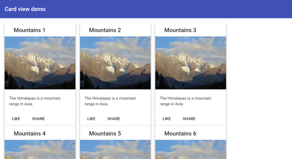
Notice the fxFlex.* directives I've added. For mobile screens, I want just one card in a row, so the width is 100%. And for tablet sizes, I want it to be just three cards so we use 33% (100/3).
And voila! Run ng serve , go into Developer tools and then see how the layout adjusts itself to screen size.
Responsive card grid view
Bonus: Change number of cards in a row dynamically
As a bonus (since you're already here), let's showcase more of the power of flex layout. Keeping our layout directives in our templates like this (instead of CSS), we can actually make them dynamic in nature. So let's create a column slider control which will allow users to change the number of cards in a row on desktop sizes!
Let's first add a material slider control at the top. For this we modify our toolbar to this (app.component.html).
<mat-toolbar color="primary">
  <span>Card view demo</span>
  <div fxHide.lt-md>
    <span class="column-label">Columns</span>
    <mat-slider
      [max]="6"
      [min]="3"
      [(ngModel)]="gridColumns"
      [thumbLabel]="true"
    >
    </mat-slider>
  </div>
</mat-toolbar>
First, we've introduced a new variable to specify the number of columns we want called gridColumns. We're using the ngModel directive to add two-way data binding to our slider control. So whenever the slider control is updated, the gridColumns variable will be updated as well. And vice versa!
Note also the fxHide.lt-md directive. fxHide on its own will just hide the slider control from view, while with the lt-md suffix, it'll only hide the control on less than medium screen sizes. This is what we want, since we don't want the column layout to change at those points!
This is another of the powerful directives the flex layout library provides us to control what to show and what not to, at different breakpoints according to our UI/UX preferences.
Also we did a bit of modification in our styles to move the button to the far right of the toolbar and also added a class for styling the columns caption.
mat-toolbar {
  justify-content: space-between;
}

.content {
  padding: 16px;
}

.content > mat-card {
  margin-bottom: 16px;
}

.column-label {
  margin-right: 8px;
  font-size: 1rem;
}
Putting it all together!
Let's now look at our app.component.ts file.
import { Component } from "@angular/core";

@Component({
  selector: "app-root",
  templateUrl: "./app.component.html",
  styleUrls: ["./app.component.scss"],
})
export class AppComponent {
  gridColumns = 3;
}
Not much here except our declaration of the gridColumns variable to a default value of 3.
To put it all together, let's see what we did with the fxFlex binding on the template.
<div
  [fxFlex]="(100/gridColumns) + '%'"
  fxFlex.xs="100%"
  fxFlex.sm="33%"
  *ngFor="let num of [1,2,3,4,5,6,7]"
>
  ...
</div>
Instead of providing a value directly, we're adding the square braces around the directive to specify an expression with our variable. This will compute to our flex value dynamically and will change as the variable changes value. The calculation itself is pretty simple!
Note, we're only doing this for the default fxFlex, since we only want it to affect the grid when on desktop size.
The great thing about flex layout is that you can add these breakpoint suffixes to just about any directive thus making it responsive. So you can add expressions and variables for all breakpoints if that is what you need!
And we're done!
If you run ng serve now and have a large enough screen size, you'll see a column slider control. When you change its value, our responsive card grid will also change, almost magically!
Thanks for reading! I hope I was able to provide some insight into how we can leverage the power of flex layout for our Angular apps.
The final code for this tutorial can be found here.
If you liked this post, you might also like the following recent post on creating a responsive sidebar menu with Angular Material CDK package!
https://zoaibkhan.com/blog/create-a-responsive-sidebar-menu-with-angular-material/
Update (11/11/2020): If you're getting a horizontal overflow and scrollbar, be sure to keep the "content" div and the flex div as separate (as in the code above!). The code has been updated to reflect this fix which was there in the original version of this article. Thanks for Jose and Phillipe for identifying in comments!
Bye! :)