Create a responsive sidebar menu with Angular Material
Sidebar navigation menus are the most common layout pattern used by web apps nowadays. But most of the components that we have are not really responsive. In this article I'm going to walk you through creating a truly responsive sidebar navigation menu in Angular using the Angular Material library.
Video tutorial
More specifically what I mean by a responsive sidebar is the following.
On desktop or larger screen sizes, we have enough real estate, so we'd like the sidebar to remain visible at all times, reminding the user of the different sections of the site. On smaller screen sizes, we'd like to hide the sidebar and show it only when the user wants to navigate to another section. Here is the final result of our tutorial showing this behavior.
Pretty clean and intuitive, right? Let's get started to see exactly how to do this!
Setting up our project
Let's first set up our Angular project by running the following commands on our terminal (with the Angular CLI).
ng new angular-responsive-sidebar
ng add @angular/material
These commands create an Angular app and add the Angular Material components library to it. Let us now import the modules we require in our app.module.ts file.
@NgModule({
  declarations: [AppComponent],
  imports: [
    BrowserModule,
    AppRoutingModule,
    BrowserAnimationsModule,
    MatToolbarModule,
    MatSidenavModule,
    MatButtonModule,
    MatIconModule,
    MatDividerModule,
  ],
  providers: [],
  bootstrap: [AppComponent],
})
export class AppModule {}
Great, now we can move on to add our components in the template!
Adding our toolbar and sidebar components
Let's add the material toolbar and the material side navigation bar to our main app.component.html file.
<mat-toolbar> Responsive side navigation </mat-toolbar>

<mat-sidenav-container>
  <mat-sidenav> </mat-sidenav>
  <mat-sidenav-content>
    <div class="content mat-elevation-z8">Main content here!</div>
  </mat-sidenav-content>
</mat-sidenav-container>
As you can see, the material side navigation component has some parts to it. The container is actually called the mat-sidenav-container. This has the mat-sidenav and the mat-sidenav-content sections inside of it.
mat-sidenav is your sidebar menu while mat-sidenav-content is the main content of your app. You could keep any content here, including a router-outlet. You'll most probably be using routes to show different sections of the site here. In our case, I've just kept some text to show it's the main content.
Let's now see how we added some styles to spice up the layout!
Styling our layout to give an elevated look
Here is how our app.component.scss file looks like for now.
mat-toolbar {
  background: #004a9f;
  color: white;
}

mat-sidenav {
  margin: 16px;
  width: 200px;
  border-right: none;
  background: #002b5c;
  color: white;
  border-radius: 10px;
  padding: 16px;
  text-align: center;
}

.content {
  height: calc(100vh - 98px);
  border-radius: 10px;
  margin: 16px;
  margin-left: 32px;

  display: flex;
  justify-content: center;
  align-items: center;

  font-size: 2rem;
  color: lightgray;
}

mat-sidenav-container {
  height: calc(100vh - 65px);
}
What we've done here is add some background and foreground colors to setup our design. Then, we've added margins for the sections to appear with some spacing between them. The fixed heights are there so the sections appear completely on the page (any scrolling will be inside of them).
Lastly, we've added some tweaks such as a rounded border and some elevation using the mat-elevation-z8 class which comes with material.
<mat-sidenav class="mat-elevation-z8"> ... </mat-sidenav>

<mat-sidenav-content>
  <div class="content mat-elevation-z8">Main content here!</div>
</mat-sidenav-content>
As a result, we have our basic layout all set up like below.
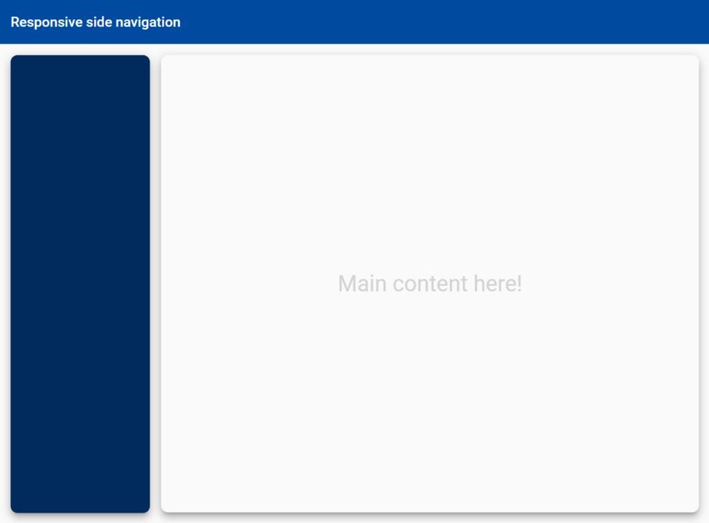
Great! Let's add some menu items and styling to our sidebar navigation menu now.
Styling our sidebar and adding the menu items
This is strictly not needed for this app, but I wanted to make a more complete example of a sidebar. If you're more interested in the functionality of the responsive sidebar in Angular, please skip to the next section!
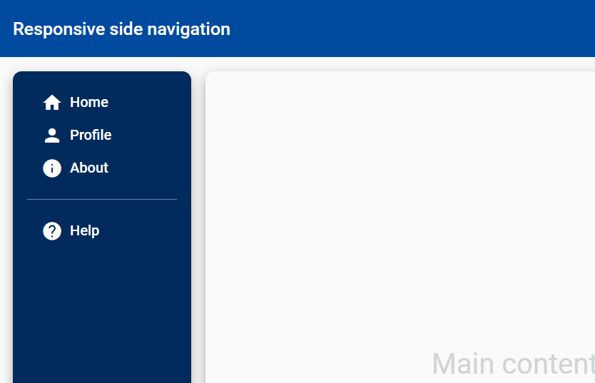
Ok, let's now add some menu items aka buttons to the sidebar.
<mat-sidenav class="mat-elevation-z8">
  <button mat-button class="menu-button">
    <mat-icon>home</mat-icon>
    <span>Home</span>
  </button>
  <button mat-button class="menu-button">
    <mat-icon>person</mat-icon>
    <span>Profile</span>
  </button>
  <button mat-button class="menu-button">
    <mat-icon>info</mat-icon>
    <span>About</span>
  </button>

  <mat-divider></mat-divider>

  <button mat-button class="menu-button">
    <mat-icon>help</mat-icon>
    <span>Help</span>
  </button>
</mat-sidenav>
This is pretty standard stuff - some material button components with icons related to them. In a real app obviously you'll also have routerLink on each of them linking to the different routes of your app. Here is how it looks like (with some styling which I'll show in a bit).
To make it more real, let's also add a section at the top of the sidebar with the profile of a user.
<img
  class="avatar mat-elevation-z8"
  src="https://source.unsplash.com/c_GmwfHBDzk/200x200"
/>

<h4 class="name">John Smith</h4>
<p class="designation">Software Engineer</p>

<mat-divider></mat-divider>
And the styles associated with these elements.
.menu-button {
  width: 100%;
  display: flex;
  align-items: center;
  justify-content: flex-start;
  font-size: 1rem;

  mat-icon {
    margin-right: 8px;
  }
}

.avatar {
  margin-top: 16px;
  width: 100px;
  height: 100px;
  border-radius: 50%;
}

.name {
  margin-top: 8px;
  font-weight: normal;
}

.designation {
  margin-top: 2px;
  font-size: 0.7rem;
  color: lightgrey;
}

mat-divider {
  margin-top: 16px;
  margin-bottom: 16px;
  background-color: rgba(255, 255, 255, 0.5);
}
For the most part, the styles have the colors and spacing needed for each of the elements. The avatar also has a border radius to give it the shape of a circle. And that's pretty much it!
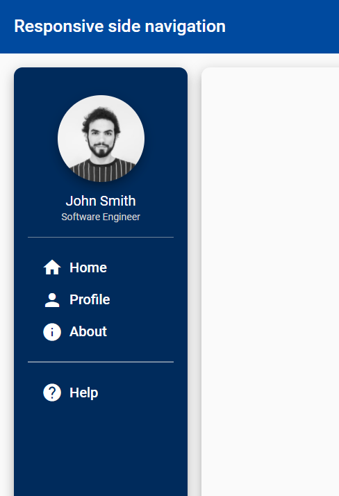
Nice. This looks much more authentic and can very well be used in a real app. Now that our sidebar looks good, let's move on to making it responsive!
Check out my related article on creating a responsive card grid in Angular here.
Making the sidebar responsive
To make the sidebar responsive, the material sidenav component provides us with a property called mode. For large screen sizes, we want the mode to be side. This means that the sidenav will always remain visible and our main content displayed with it.
The other mode is over. We'll need this when we want the sidebar to be hidden normally, but only appear over the content when we want to navigate to some other section.
So all we need is a way to switch between these modes when the screen size changes. Fortunately, we can detect screen size changes with the Angular CDK layout package and its BreakpointObserver service. Let's see some code!
export class AppComponent {
  @ViewChild(MatSidenav)
  sidenav!: MatSidenav;

  constructor(private observer: BreakpointObserver) {}

  ngAfterViewInit() {
    this.observer.observe(["(max-width: 800px)"]).subscribe((res) => {
      if (res.matches) {
        this.sidenav.mode = "over";
        this.sidenav.close();
      } else {
        this.sidenav.mode = "side";
        this.sidenav.open();
      }
    });
  }
}
There are a few things going on here. Let's go through them one by one.
First, we have a ViewChild decorator at the very top to get the MatSidenav component reference in our code. Then, we include the BreakpointObserver service in our constructor.
We're using the observe method of the BreakpointObserver which can take in any number of breakpoints. If any of them matches or changes state (i.e. stops matching), all subscriptions to the method are notified.
In our case, we're using 800px as our breakpoint. This means if it matches, we've to switch to the over mode for our sidebar and close it. And vice versa, if it doesn't match.
Remember to keep the subscription in the ngAfterViewInit lifecycle method, so that we're assured we have the sidenav initialized before calling it!
Great! Now if you reduce and increase your screen width using Developer tools, you'll be able to see the sidebar appearing and disappearing as we want it.
Adding the sidebar menu toggle button for small screens
But wait, while the sidebar navigation menu hides on smaller screens, we have no way for it to show itself when we need it. We need a menu toggle button allow opening and closing of the menu on smaller screens! Let's add that now.
<mat-toolbar class="mat-elevation-z8">
  <button
    mat-icon-button
    *ngIf="sidenav.mode === 'over'"
    (click)="sidenav.toggle()"
  >
    <mat-icon *ngIf="!sidenav.opened"> menu </mat-icon>
    <mat-icon *ngIf="sidenav.opened"> close </mat-icon>
  </button>
  Responsive side navigation
</mat-toolbar>

<mat-sidenav #sidenav="matSidenav" class="mat-elevation-z8"> ... </mat-sidenav>
The first thing you need to note is at the very bottom. We've added a template variable for the sidenav component using the #sidenav="matSidenav" syntax. This is basically doing the same thing as we did with the ViewChild decorator before, but this makes the reference available in the template.
For the toggle button, we're using a material icon button. We've added an *ngIf directive to it so that it only shows when the sidenav has the over mode, which will happen on smaller screens. The button's click event simply calls the toggle function of the sidenav component.
Lastly, we add some additional *ngIf directives to check whether the sidenav is open or not and show a different icon so it's visually clear to the user.
And that's it! Here's our finished product again. A clean and intuitive responsive sidebar in Angular for you 🔥
Conclusion
With the proliferation of tablets and mobiles nowadays, it is a given that your web app needs to be responsive in its layout. This article provides for one way of making a responsive sidebar in Angular with material components and the CDK package.
If we give some thought to it, this can be combined with other components to make them responsive as well with not much effort - providing an intuitive interface to your users whichever platform they use!
I hope you've found this useful in some way. If so, check out my other related articles below and/or follow me on twitter for updates on future articles!
The complete code for this tutorial can be found at this github repository.
Thanks for reading! Bye 😊