
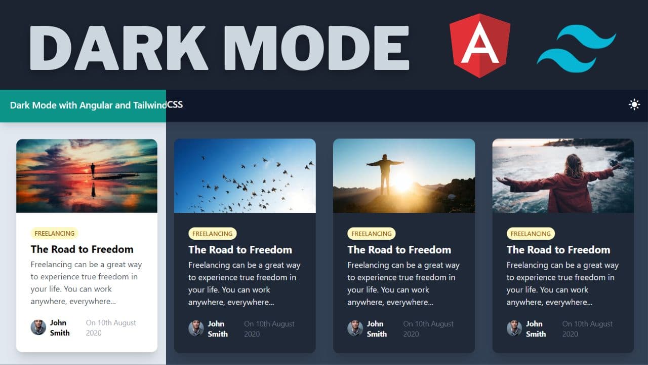
How to create a Dark Mode with Angular and TailwindCSS
As developers, we strive to make user experience as great as possible. Dark mode has become an essential modern web app feature that enhances user convenience, especially for those who prefer a softer light on their screens during low light conditions.
Video tutorial
If you have Angular apps that have yet to implement the dark mode feature, you may be shortchanging your users. However, all is not lost!
In this post, I will walk you through a simple process of incorporating dark mode into your Angular app using Tailwind CSS. As an added bonus, I'll also show you how to store the dark mode preference on your user's browser local storage, ensuring a seamless user experience upon return visits.
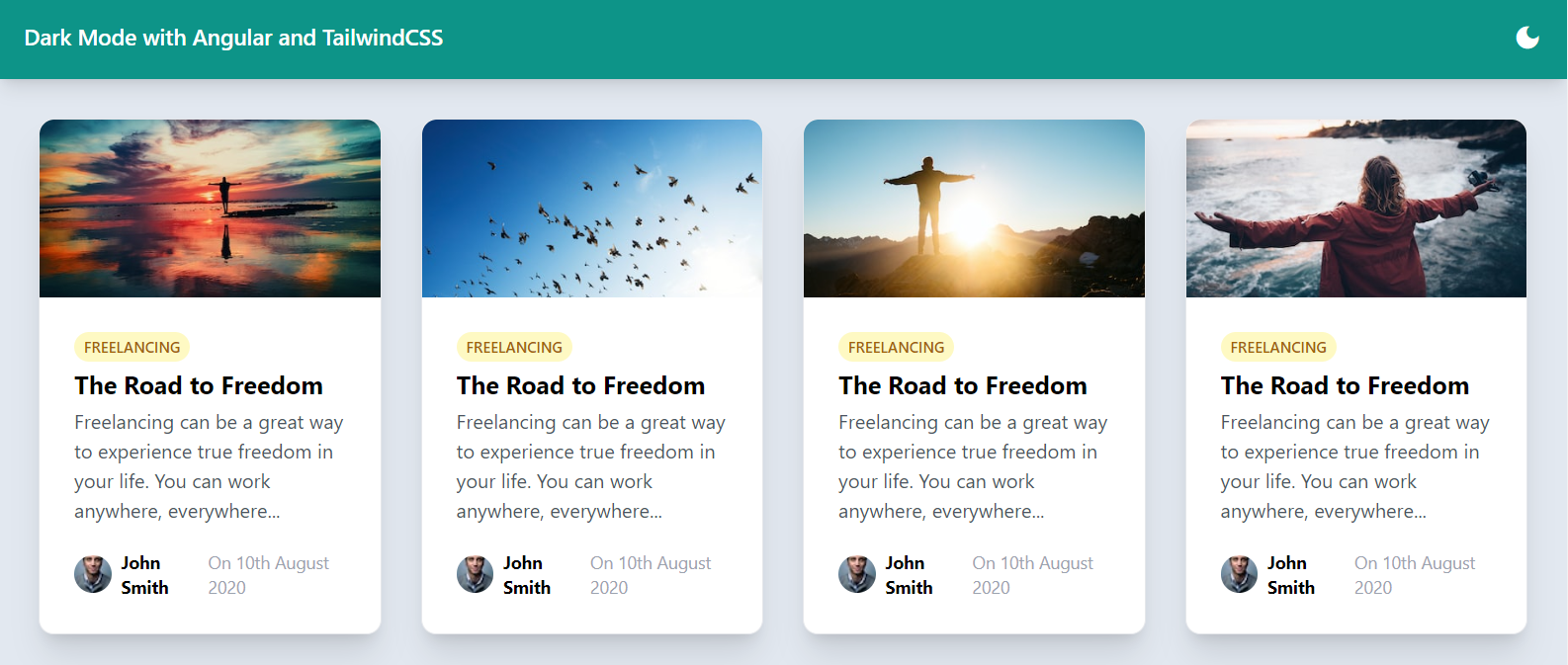
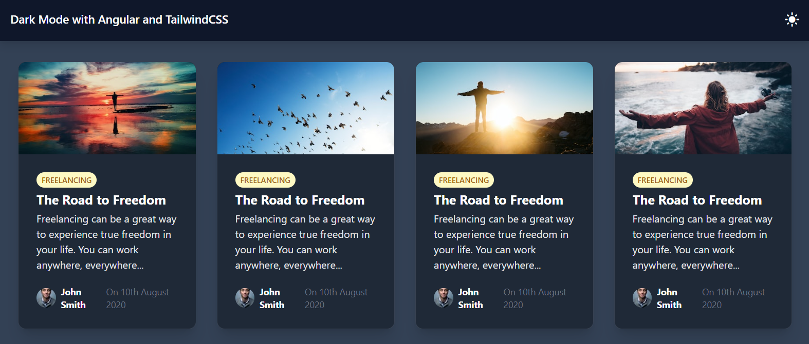
Final result would be something like below!
Setting up the Angular App and TailwindCSS
First things first, we need to get a new Angular application up and running. We do this by making use of the Angular 16 CLI ng new command with the standalone flag.
ng new your-app-name --standalone
Follow the instructions to complete the setup process.
The next step is to incorporate Tailwind CSS into your Angular project. Detailed instructions on this process can be found on the Tailwind CSS official documentation. Follow the outlined steps and get your Tailwind CSS ready to go.
Crafting a Basic User Interface
To exhibit how dark mode works, we need to design a simple User Interface (UI) that will consist of a basic container and a toolbar. We'll give a slate background to the container and a nice teal color to the toolbar in addition to some other styling. So let's add the following to our template in app.component.ts.
<div class="min-h-screen min-w-full bg-slate-200 ">
  <div class="bg-teal-600 text-white p-5 font-semibold text-lg shadow-lg"></div>
</div>
In the toolbar, we'll add a title and an icon button for toggling dark/light mode. The icons for the button are powered by the Material Icons library. So, we need to add the Material Icons library link to the index.html file.
<link
  href="https://fonts.googleapis.com/icon?family=Material+Icons"
  rel="stylesheet"
/>
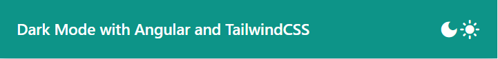
We then proceed to add the Material Icon for dark mode and light mode within our button, ensuring our users can easily switch between light and dark mode.
<div>
  Dark Mode with Angular and TailwindCSS
  <button>
    <span class="material-icons">dark_mode</span>
    <span class="material-icons">light_mode</span>
  </button>
</div>
To align the button to the right of the title, we use flex and the justify-between class from TailwindCSS on the toolbar div.
<div class="flex justify-between ...">...</div>
As a result, we have a nice looking toolbar with our icons. Great!
Creating a Signal for Dark Mode Toggling
We'll add a signal that stores the dark mode value. This signal has a boolean type with an initial value of false, which corresponds to light mode. We can use the signal's value to show or hide the dark and light mode icons using Angular's *ngIf directive. Additionally, we also create a click handler that toggles the value of this signal when clicked.
Consider the following code snippets.
export class AppComponent {
  darkMode = signal<boolean>(false);
}
<button
  class="flex transition-transform hover:scale-125 align-middle"
  (click)="darkMode.set(!darkMode())"
>
  <span *ngIf="!darkMode()" class="material-icons">dark_mode</span>
  <span *ngIf="darkMode()" class="material-icons">light_mode</span>
</button>
Here, when dark mode signal is enabled, the "light_mode" icon shows, and when it's disabled, the "dark_mode" icon displays.
When we test this out, we can see dark mode signal is toggling seamlessly between the two states!
Adding Animated Button for User Interactivity
An important rule of thumb in UI design is to ensure all elements are interactive and responsive. To make our button a bit more interactive, we added some transitions and transform effects through TailwindCSS's built in utility classes.
<button class="flex transition-transform hover:scale-125">...</button>
With these classes added, when the button is hovered over, it expands subtly, creating a scaling effect that boosts interactivity.
Enabling Dark Mode in Tailwind CSS
While we’ve set up the dark mode signal that toggles the dark mode button, it has no real effect on the styles of the page yet. To do that, we can leverage the built-in dark mode feature of Tailwind CSS as follows.
- Add a configuration (
darkMode: 'class') totailwind.config.js:
module.exports = { ..., darkMode: "class", ... };
- Add the
.darkclass to the root element of the Angular app using the@HostBindingdecorator:
@HostBinding('class.dark') get mode() {return this.darkMode(); }
- Add dark variants to our templates to signal to Tailwind CSS which styles to apply when dark mode is on:
<div class="bg-gray-100 dark:bg-gray-900"><!-- ... --></div>
With these changes, our dark mode is fully functional! When you toggle dark mode, it will switch to a darker version of your UI.

I've also added simple blog card layout to demonstrate the dark mode in a more real world setting.
If you'd like, you can check out the github link at the end of the post to see the complete code yourself
Implementing Dark Mode Preferences in Browser’s Local Storage
Every time a user refreshes the browser, our app reverts to light mode by default. This resetting can be irritating to our users. As such, we need to devise a way to remember the user's dark mode preferences.
To pull this off, we're going to employ the browsers local storage API to store our dark mode setting and we'll use the new Signals API effect primitive to do so. An effect runs every time a signal changes, including the initial value.
To learn more about the new Signals API and primitives, head over to this blog post series on Angular Signals I created recently just for this purpose.
constructor() {
    effect(() => {
      window.localStorage.setItem('darkMode', JSON.stringify(this.darkMode()));
    });
}
Also, we need to get the initial value of the signal from localStorage as well.
darkMode = signal<boolean>(
  JSON.parse(window.localStorage.getItem("darkMode") ?? "false")
);
This way, every time the user reloads the page, the app will check if there’s a dark mode preference in local storage and load based on that setting.
When you test out now, you'll see the app remembers our dark mode preferences on refresh of the browser!
Wrapping Up
And that's a wrap! In this tutorial, we've seen how to implement dark mode in an Angular app with the help of Tailwind CSS. Even better, we've figured out how to store these preferences in the browser's local storage, making our apps more user-friendly. From here, you can go on and build up your UI further as you want.
If you found this post useful, do visit my blog for more such tutorials.
Check out the source code for this app on GitHub.
Thanks for being here with me! Bye :)
Check out my Angular and Firebase Authentication crash course
Use Angular 16, Angular Material and Firebase Authentication, Firestore and Storage to create a complete Sign Up App!
You may also like...


Learn Angular and Firebase!
Use Angular 16, Angular Material and Firebase Authentication, Firestore and Storage to create a complete Sign Up App!