
YouTube Style Collapsible Sidebar with Angular Material
In one of my recent projects, I stumbled upon the YouTube Studio sidebar and was captivated by its smooth animations and sleek design. Inspired, I set out to replicate this sidebar in an Angular application, utilizing Angular Material to achieve a similar look and feel. In this blog post, I'll walk you through how I accomplished the following, step-by-step.
Video tutorial
If you're more into video tutorials, here is the video version of it. While you're at it, hit that subscribe button on my YouTube channel so you can get notified in the future!
Getting Started with Angular and Angular Material
First things first, let's set up our Angular project. I used Angular CLI version 16 for its latest features, including signals, which is great for managing component state reactively. After installing the CLI, I created a new project using the ng new command with the --standalone option, preferring to use inline templates and styles for this specific project. This approach keeps everything in a single file, making it easier to follow along for small projects like this one.
ng new youtube-sidebar --standalone --inline-style --inline-template
Once the project was bootstrapped, the next step was adding Angular Material to the project using ng add @angular/material. This command sets up Angular Material and its dependencies in the project, allowing us to use its rich set of UI components and theming capabilities.
Setting Up the Sidebar UI
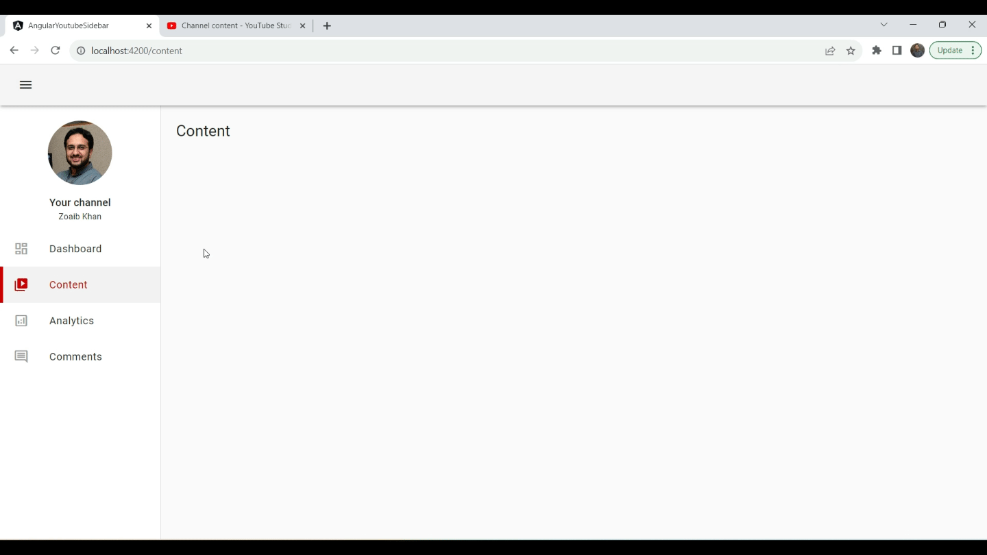
With the project set up, I focused on constructing the sidebar's UI. Angular Material's MatToolbarModule was perfect for the top toolbar, while the MatSidenavModule provided the functionality needed for the collapsible sidebar.
- Toolbar and Sidenav: The application's root component (
app.component.ts) was updated to include a<mat-toolbar>for the top navigation and a<mat-sidenav-container>that houses the sidebar (<mat-sidenav>) and the main content area (<mat-sidenav-content>). I added a custom height to the sidenav container so that we get individual scrollbars for the content and the sidenav itself.
mat-sidenav-container {
  height: calc(100vh - 64px);
}
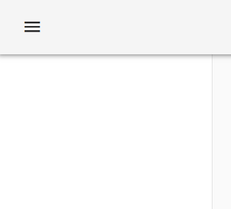
- Collapsible Feature: To make the sidebar collapsible, I utilized Angular Material's
openedandmodeproperties of<mat-sidenav>. AMatIconButtonwith a hamburger icon toggles the sidebar's state, and Angular signals handle the state reactivity. The collapsed state of the signal is also passed in as an input to the custom sidenav component.
<mat-toolbar class="mat-elevation-z3">
  <button mat-icon-button (click)="collapsed.set(!collapsed())">
    <mat-icon>menu</mat-icon>
  </button>
</mat-toolbar>
<mat-sidenav-container>
  <mat-sidenav opened mode="side" [style.width]="sidenavWidth()">
    <app-custom-sidenav [collapsed]="collapsed()" />
  </mat-sidenav>
  <mat-sidenav-content class="content" [style.margin-left]="sidenavWidth()">
    <router-outlet></router-outlet>
  </mat-sidenav-content>
</mat-sidenav-container>
I also created a computed called sidenavWidth to conditionally adjust the width of the sidenav and the content. Gotta love the reactive nature of signals!
collapsed = signal(false);
sidenavWidth = computed(() => (this.collapsed() ? "65px" : "250px"));
- Custom Sidenav component: I built up a custom sidenav component template using custom styling to mimic the YouTube sidebar style. The following is the top section.
<div class="sidenav-header">
  <img [width]="100" [height]="100" src="//assets/profile-pic.jpg" />
  <div class="header-text">
    <h2>Your channel</h2>
    <p>Zoaib Khan</p>
  </div>
</div>
.sidenav-header {
  padding-top: 24px;
  text-align: center;

  > img {
    border-radius: 100%;
    object-fit: cover;
    margin-bottom: 10px;
  }

  .header-text {
    height: 3rem;

    > h2 {
      margin: 0;
      font-size: 1rem;
      line-height: 1.5rem;
    }

    > p {
      margin: 0;
      font-size: 0.8rem;
    }
  }
}

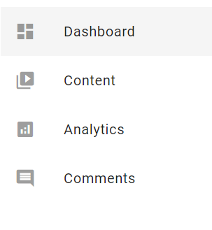
The sidebar's menu items were dynamically generated using Angular’s *ngFor directive, iterating over a predefined list of routes and icons. Angular Material's MatList was used to ensure proper styling and interaction states.
menuItems = signal<MenuItem[]>([
  {
    icon: "dashboard",
    label: "Dashboard",
    route: "dashboard",
  },
  {
    icon: "video_library",
    label: "Content",
    route: "content",
  },
  ...
]);
<mat-nav-list>
  <a mat-list-item class="menu-item" *ngFor="let item of menuItems()">
    <mat-icon matListItemIcon>{{ item.icon }}</mat-icon>
    <span matListItemTitle>{{ item.label }}</span>
  </a>
</mat-nav-list>
Implementing Sidebar Navigation
The core functionality of a sidebar is navigation. Using Angular’s Router, I set up routing for the application. Each menu item in the sidebar corresponds to a different component or page within the application, seamlessly integrating with Angular's router to enable smooth navigation between different views.
export const routes: Routes = [
  {
    path: '',
    pathMatch: 'full',
    redirectTo: 'dashboard',
  },
  {
    path: 'dashboard',
    component: DashboardComponent,
  },
  {
    path: 'content',
    component: ContentComponent,
  },
  ...
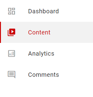
Routing and Active State: Each menu item utilized Angular's routerLink to navigate between components. To visually indicate the current active route, I used the RouterLinkActive directive, changing the appearance of the active menu item to match YouTube Studio's sidebar.
<a
  mat-list-item
  class="menu-item"
  *ngFor="let item of menuItems()"
  [routerLink]="item.route"
  routerLinkActive="selected-menu-item"
  #rla="routerLinkActive"
  [activated]="rla.isActive"
>
  <mat-icon
    [fontSet]="
            rla.isActive ? 'material-icons' : 'material-icons-outlined'
          "
    matListItemIcon
    >{{ item.icon }}</mat-icon
  >
  <span matListItemTitle>{{ item.label }}</span>
</a>
I conditionally change the menu items left border color by using the following style and also changed the icon style using the fontSet property of the material icon component.
Note: you need to import both icon styles for this to work. For example, use the following link in index.html
<link
  href="https://fonts.googleapis.com/icon?family=Material+Icons|Material+Icons+Outlined"
  rel="stylesheet"
/>
//Default style
.menu-item {
  border-left: 5px solid;
  border-left-color: rgba(0, 0, 0, 0);
}

//Active style - primary color css variable will be set in theming section
.selected-menu-item {
  border-left-color: var(--primary-color);
  background: rgba(0, 0, 0, 0.05);
}
Styling and Animations
The sidebar's look and feel were further refined using CSS. I introduced transitions to smoothly animate the sidebar's expansion and collapse states. To mimic the YouTube Studio sidebar's behavior, I added custom styles and animations for the sidebar content, ensuring elements like the sidebar header and menu items adjusted their sizes and visibility accordingly.
<div class="sidenav-header">
  <img
    [width]="profilePicSize()"
    [height]="profilePicSize()"
    src="//assets/profile-pic.jpg"
  />
  <div class="header-text" [class.hide-header-text]="sideNavCollapsed()">
    <h2>Your channel</h2>
    <p>Zoaib Khan</p>
  </div>
</div>
<mat-nav-list>
  <a mat-list-item>
    <span matListItemTitle *ngIf="!sideNavCollapsed()">{{ item.label }}</span>
  </a>
</mat-nav-list>
//Use a signal to store the input collapsed state for reactivity
sideNavCollapsed = signal(false);
@Input() set collapsed(val: boolean) {
    this.sideNavCollapsed.set(val);
}

//This is used to dynamically adjust the profile picture size based on collapsed state
profilePicSize = computed(() => (this.sideNavCollapsed() ? '32' : '100'));
:host * {
  transition: all 500ms ease-in-out;
}

.hide-header-text {
  opacity: 0;
  height: 0px !important;
}
Also, I enabled CSS transitions on the main app.component.ts as well so that the collapse and expand are smooth!
mat-sidenav,
mat-sidenav-content {
  transition: all 500ms ease-in-out;
}
Adding Finishing Touches
The final touch was theming and ensuring that the sidebar's appearance closely matches YouTube Studio's aesthetic. Through the use of Angular Material's custom theming system and custom CSS variables, I was able to replicate the exact color scheme and styles of YouTube's sidebar, making the UI consistent and visually appealing.
@use "@angular/material" as mat;
@include mat.core();

body {
  ...
  --primary-color: #cc0000;
}

$mat-primary: (
  main: #cc0000,
  lighter: #f0b3b3,
  darker: #b90000,
  200: #cc0000,
  contrast:
    (
      main: #ffffff,
      lighter: #000000,
      darker: #ffffff,
    ),
);

$theme-primary: mat.define-palette($mat-primary, main, lighter, darker);
$theme-accent: mat.define-palette(mat.$indigo-palette, A200, A100, A400);

$my-theme: mat.define-light-theme(
  (
    color: (
      primary: $theme-primary,
      accent: $theme-accent,
    ),
    typography: mat.define-typography-config(),
    density: 0,
  )
);

@include mat.all-component-themes($my-theme);
Conclusion
Recreating the YouTube Studio sidebar in Angular with Angular Material proved to be an insightful project. By breaking down the project into manageable parts—from setting up the environment to implementing routing and adding animations—I was able to achieve a functional and aesthetically pleasing sidebar.
I hope this walkthrough inspires you to embark on your own projects, leveraging Angular and Angular Material to create intuitive and dynamic web interfaces. Whether you're building a dashboard, a blog, or any web application, these tools offer a solid foundation to create responsive and interactive UIs.
For those interested in diving deeper into the code, you can get it from my shop at the following link: Youtube Style Sidebar Code
If you found this post helpful or have any questions, feel free to share your thoughts in the comments below.
Check out my Angular and Firebase Authentication crash course

Use Angular 16, Angular Material and Firebase Authentication, Firestore and Storage to create a complete Sign Up App!
You may also like...


Learn Angular and Firebase!
Use Angular 16, Angular Material and Firebase Authentication, Firestore and Storage to create a complete Sign Up App!