
Create a responsive card grid in Angular with CSS (2023 edition)
Don’t you just love a good card grid? Well, I know I do. Card grids light up the web! They allow us to present our information in a user friendly way - using images and graphics as we please.
Video tutorial

But often times, grids seem to be working great on desktop sizes where you have a lot of space to put your cards in but as soon as you shrink your screen even a little bit, you can see things getting squished and squashed and your cards getting all messed up!
Not a good sight, is it?
In this article, we’ll fix this problem and make a responsive card grid using the Angular material components and a bit of CSS magic. And in the end we’ll have this gorgeous looking card grid which neatly adjusts itself as you resize your screen.
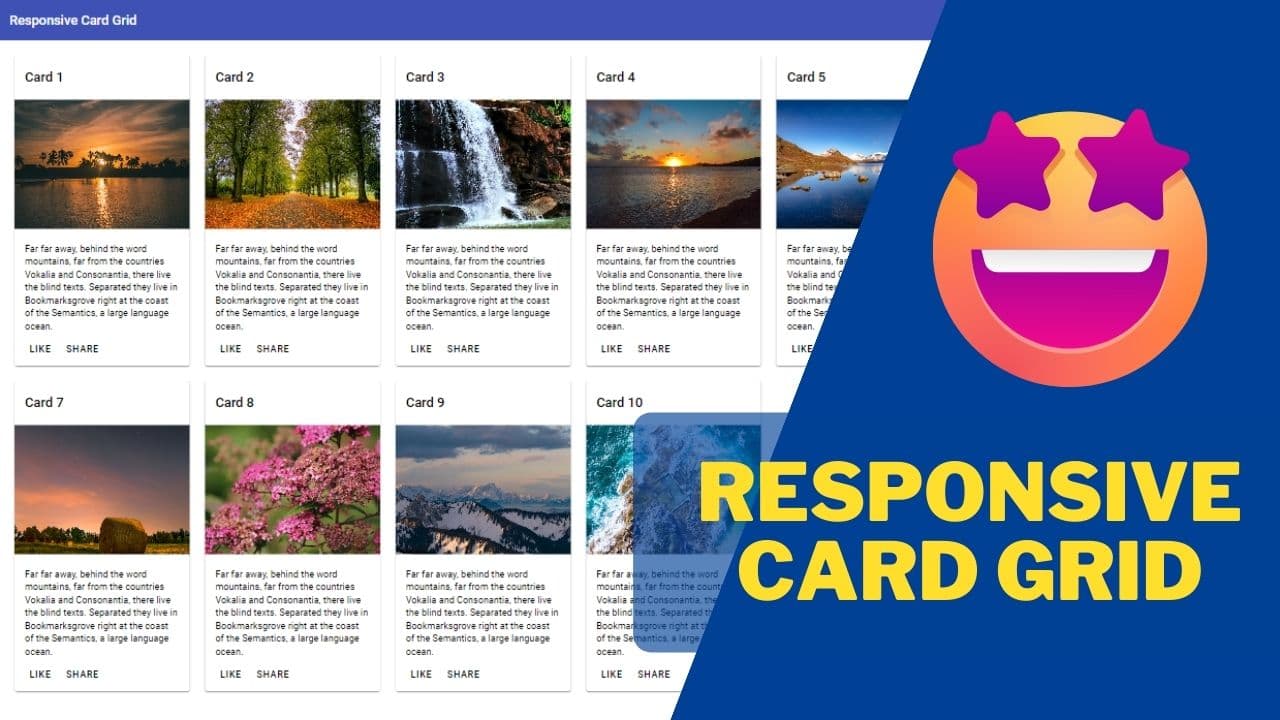
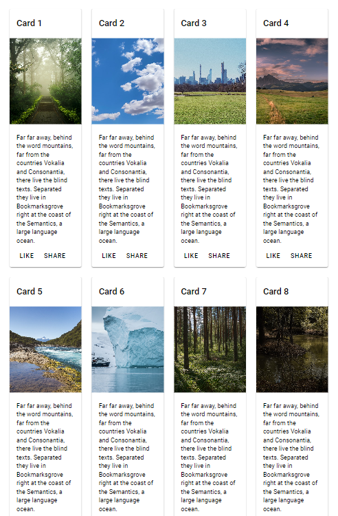
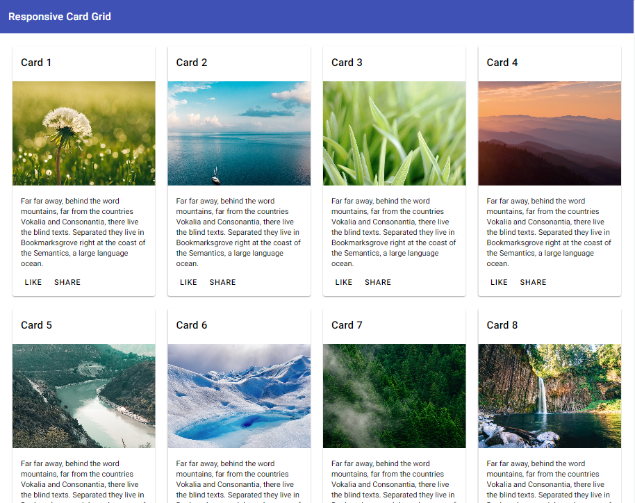
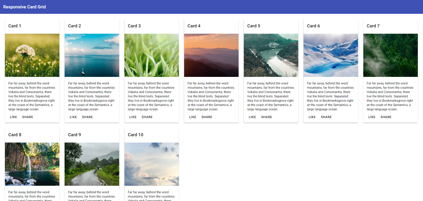
Final Result
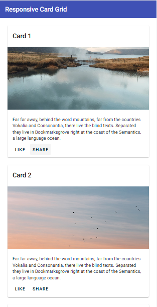
Desktop and greater breakpoints
Tablet size
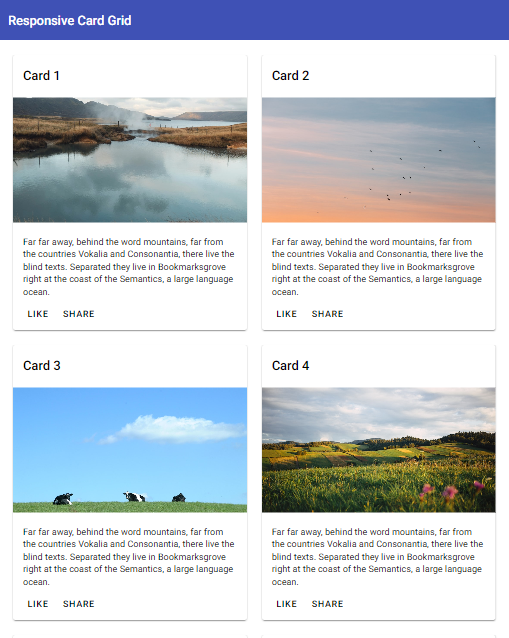
Mobile size
So let’s get started!
Setting up the project
First, let's create a new angular app and add Angular material to it. With the latest Angular v16, these are the two commands that you need.
ng new —standalone
This will create a completely NgModule-less standalone project for you. Just follow along with the prompts for the name and other settings for the project.
ng add angular material
This command will install Angular Material component library to the project.
Creating the data structures
Next, let’s setup our data for the cards. First we'll define a type for each of our card's content. We'll add it to the top of the main app.component.ts file.
type CardContent = {
  title: string;
  description: string;
  imageUrl: string;
};
Nothing fancy, just the title, description and url of the image to be used in the card.
Getting images from Unsplash
We'll get our images from Unsplash, which is a free public respository of community images. We'll first add a list of tags which will help us get a random image from Unsplash's source API.
images = [
  "nature",
  "sky",
  "grass",
  "mountains",
  "rivers",
  "glacier",
  "forest",
  "streams",
  "rain",
  "clouds",
];
We can then use these keywords to create the image URL that we want, assuming we're looping through the image tags above.
const imageUrl = `https://source.unsplash.com/random/500X500?${this.images[i]}`;
But before that, let's add a signal to store our cards!
Creating a signal and adding data to it
Signals are a new reactive primitive in Angular released as a developer preview in v16. They're basically a replacement to variables in the component but are reactive in nature - so Angular knows exactly where to update the template when they change.
If you'd like a better introduction, you might find my blog post on signals helpful!
We're going to store our cards in a signal. Let's define it now in the same file with an initial value of an empty array. Note we're using the type of CardContent which we defined before.
cards = signal<CardContent[]>([]);
Next, we'll update the signal's value with our cards data. We'll do that by looping through the image tags in the constructor.
constructor() {
    const cards: CardContent[] = [];
    for (let i = 0; i < this.images.length; i++) {
      cards.push({
        title: `Card ${i + 1}`,
        description: `Far far away, behind the word mountains, far from the countries Vokalia and Consonantia, there live the blind texts. Separated they live in Bookmarksgrove right at the coast of the Semantics, a large language ocean. `,
        imageUrl: `https://source.unsplash.com/random/500X500?${this.images[i]}`,
      });
    }

    this.cards.set(cards);
  }
After creating an array of CardContent and populating it with the cards' titles, description and the image URL from Unsplash, we'll use the set method of the signal to update its value.
Great! So far so good.
Adding the card grid template
Next, we need to actually show these cards on the UI - so we need to add them to the template. I'm going to do it in the same file as an inline template. Feel free to use a separate template file if you'd like to do so!
First, we include some Material modules we need in the component's imports array.
  @Component({
  selector: 'app-root',
  standalone: true,
  template: ``,
  styles: [``],
  imports: [CommonModule, MatCardModule, MatToolbarModule, MatButtonModule],
})
Then, we'll add the toolbar and containing div with a class of container and responsive-grid.
<mat-toolbar color="primary"> Responsive Card Grid </mat-toolbar>
<div class="container responsive-grid"></div>
We'll add some styling for these classes in a bit.
Next, we add the actual cards using an *ngFor directive and the mat-card component.
<div class="container responsive-grid">
  <mat-card *ngFor="let card of cards()">
    <mat-card-header>
      <mat-card-title>{{ card.title }} </mat-card-title>
    </mat-card-header>
    <br />
    <img mat-card-image [src]="card.imageUrl" />
    <mat-card-content>
      <br />
      <p>{{ card.description }}</p>
    </mat-card-content>
    <mat-card-actions>
      <button mat-button>LIKE</button>
      <button mat-button>SHARE</button>
    </mat-card-actions>
  </mat-card>
</div>
For signals, we access the value by calling the signal as a function, so we do that here by calling cards(). Then, we simply use that data to plug in the different sections of the mat-card component.
If you want, you can modify or add data to the card as you please. I've gone with a typical structure of a material card so that it's a good representative of a card grid
Great! Time to test it out a bit. So let's do ng serve --open and see what we get.

Ok, that's downright awful! And the reason is we're yet to add our styles. Let's do that next.
Adding some styles to our grid
We'll start by adding some padding to the grid container, so it's not that close to the edges.
.container {
  padding: 24px;
}
Next, we need to add some styling to the images. For images in a card, we need to ensure that they're of similar sizes. Otherwise, the card grid won't look good at all.
To achieve this, we do three things.
First, we give a fixed height to all the images.
Then, we extend the width of the image to the width of the card.
Lastly, we use the object-fit: cover property to ensure that the image covers the placeholder without affecting the aspect-ratio of the original image.
img {
  width: 100%;
  height: 200px;
  object-fit: cover;
}
If we don't add the
object-fit: coverproperty, our images will appear squashed or stretched - which we don't want.
When we test out our card grid now, we can see the images are sized much better than before!
Of course, the only thing left now is the grid itself. So let's do that next.
Adding the card grid styling
To create our grid, all we need to do is to add some styling to the responsive-grid class we created in the template. We'll first add a simple CSS grid with four columns.
.responsive-grid {
  display: grid;
  grid-template-columns: repeat(4, 1fr);
  gap: 24px;
}
You can learn more about the CSS grid specs here.
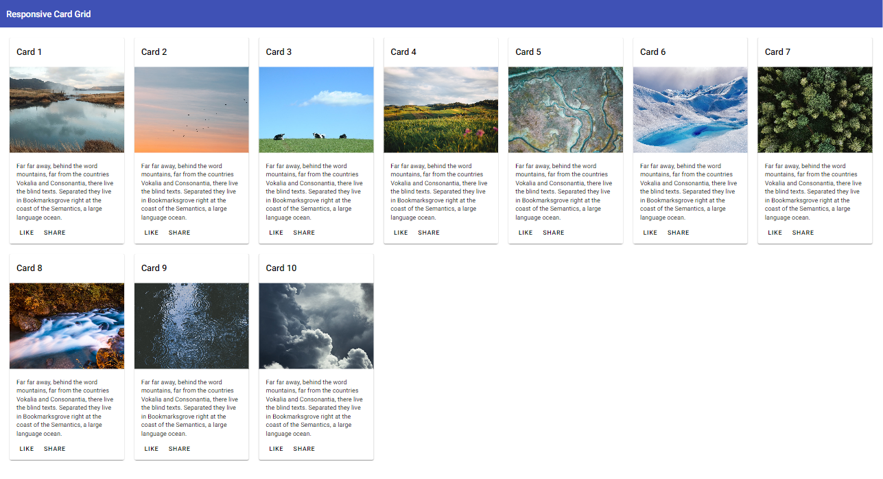
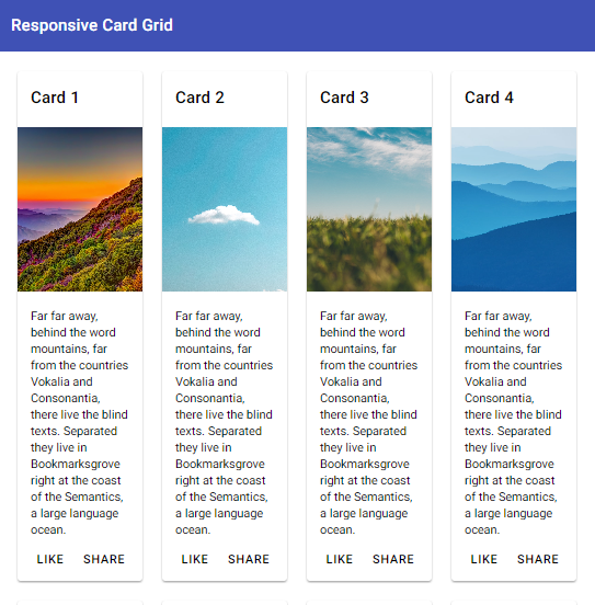
And it looks quite nice!
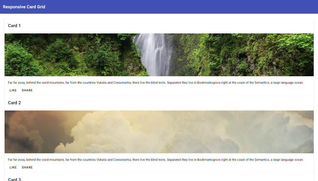
But what happens when we try to reduce the screen width?
Ouch! Not that nice, is it?
Making our card grid responsive with CSS
To make a card grid responsive in Angular, earlier we used to have @angular/flex-layout as the go-to package. However, since it's deprecation and introduction of better CSS grid support, all we need is a bit of magic CSS and we'll be good to go.
So firstly, instead of using a static value for the number of columns, we're going to use the auto-fill value. This means the CSS grid is automatically going to figure out how many columns it needs.
.responsive-grid {
  ...
  grid-template-columns: repeat(auto-fill, minmax(250px, 1fr));
  ...
}
How is it going to figure that out?
Well, by looking at the required size of the cards.
We can give here a minmax function instead of a single value. The maximum here would be 1fr - which means the card widths will be equally distributed across the screen width.
But the minimum width is really the important part here.
The value in the minimum will ensure that the cards don't get squished beyond a certain size. For our cards, I've kept it at 250px - but you can use whatever minimum size you're willing to tolerate for your cards.
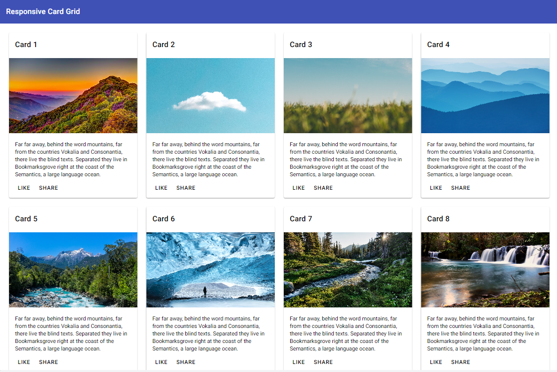
Ok, let's see this in action now!
We've our 4 column grid like this, as before.
But when we try to reduce the screen size, instead of getting squished, our card grid adjusts itself to reduce the number of cards in a row.

And the great thing is: this will also work on very large screen sizes! The grid will automatically bring in more cards on the row.
Conclusion
And that's it! No need for special handling for screen breakpoints or other fancy CSS, all you need is a line of CSS and you have a completely responsive material card grid in Angular.
I hope you enjoyed building up this responsive card grid, as much as I did while making it.
If you'd like to reference the source code, here is the github link to the complete app.
Thanks for being here and have a nice day! :)
Check out my Angular and Firebase Authentication crash course

Use Angular 16, Angular Material and Firebase Authentication, Firestore and Storage to create a complete Sign Up App!
You may also like...


Learn Angular and Firebase!
Use Angular 16, Angular Material and Firebase Authentication, Firestore and Storage to create a complete Sign Up App!