

How to build an Image Cropper Control in Angular
In this tutorial we'll be exploring how to build a robust Image Control Component in Angular that enables users to crop their photos to preferred dimensions right before they get uploaded to the server. If you've ever wondered how to do this, you're about to find out!
Video

Consider this scenario, a user chooses a photo (probably too big or not having the right aspect ratio) which is then cropped further consequently creating an ideal frame. This resultant photo is then uploaded to the server. This ensures the photos maintain the correct aspect ratio and size, saving significant space on your server.
Excited? Let's dive in!
Setting Up An Angular Standalone Project
First, we need to create a new Angular standalone project. Here's how to do it:
ng new --standalone --inline-style --inline-template
We've also added the inline style and template parameters so we can develop a component completely in one file.
You can choose to opt out of this, if you prefer separate files for the template and styles
After that, we need to install a couple of packages
ng add @angular/material
npm install ngx-image-cropper
The Angular Material dialog and the image cropper from the ngx-image-cropper package will work together to build our reusable cropper component.
Creating the Image Control and Cropper Dialog Components
Now let's create the two components that we'll need: the Image Control and the Cropper Dialog.
ng g component components/image-control
ng g component components/cropper-dialog
These commands will create the two components respectively. The Cropper Dialog represents the Angular Material Dialog.
Basic UI setup
After creating these components, we move on to the AppComponent to setup our basic UI structure.
In our template, we create a mat-toolbar and give it a color of primary. Below the toolbar, we add a div with the class of container and some padding.
@Component({
  selector: 'app-root',
  standalone: true,
  imports: [CommonModule, MatToolbarModule, ImageControlComponent],
  template: `
    <mat-toolbar color="primary"> Angular Image Cropper </mat-toolbar>

    <div class="container">

    </div>
  `,
  styles: [
    `
      .container {
        padding: 24px;
      }
    `,
  ],
})
Configuring the Image Control Component with Inputs
Inside this div, we're going to add our Image Control component, but not without adding two inputs to it. Making this component configurable means that you can crop the image to any desired width and heights.
We also want our input values to be reactive, so whenever they change Angular automatically updates the control's dimensions accordingly. Therefore, we'll store these inputs in signals by using setters for them.
export class ImageControlComponent {
  imageWidth = signal(0);
  @Input() set width(val: number) {
    this.imageWidth.set(val);
  }

  imageHeight = signal(0);
  @Input() set height(val: number) {
    this.imageHeight.set(val);
  }
}
Creating a placeholder for the image control
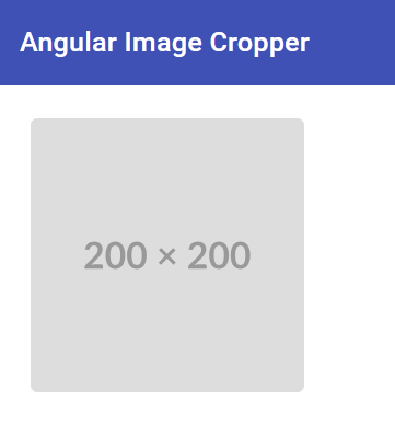
Since we don't have the image yet, we make use of a placeholder for now. We generate the placeholder using a computed signal that derives from our signals for image height and width.
The URL is from a pretty nifty utility service called placehold.co - where we can just pass in the dimensions and we get a placeholder image of the same.
placeholder = computed(
  () => `https://placehold.co/${this.imageWidth()}x${this.imageHeight()}`
);
Then we use this placeholder URL returned in the source of the image. Finally, we set up the image with the same dimensions as the values passed in and replace the placeholder with the required image.
<div [style.width]="imageWidth() + 'px'">
  <img [src]="placeholder()" [height]="imageHeight()" [width]="imageWidth()" />
</div>
As a result, our image control now is fully reactive - which means whenever the width and/or height changes, the placeholder will change automatically using the power of Signals!
If you need an introduction to the new Signals API in Angular, you might find my series of blog posts here useful
Finishing touches to the Image Control UI
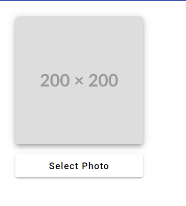
Next, we add a button in the Image Control Component for photo selection and a bit of mat-elevation-z5 to the image so that things looks even better.
<div [style.width]="imageWidth() + 'px'">
  <img ... class="mat-elevation-z5" />
  <button mat-raised-button>Select Photo</button>
</div>
Now that we have a basic structure of the Image Control Component, we are ready to advance to the second part of our task – creating the Cropper Dialog Component.
Creating the Cropper Dialog Component
We start by defining the two data types for the dialog’s input and result. Here, we create the CropperDialogData interface containing the image, width, and height objects. We define these right on top of the cropper dialog component.
export type CropperDialogData = {
  image: File;
  width: number;
  height: number;
};

export type CropperDialogResult = {
  blob: Blob;
  imageUrl: string;
};
The result would contain the Blob data type, which we can upload to our server, and a URL to display the Blob wherever we'd like.
Configuring Cropper Dialog Component
Next, we inject the MAT_DIALOG_DATA in the Cropper Dialog component so that we can access the parameters which we'll send while opening the mat-dialog.
Also, we add a new signal in which we'll store the data returned by the cropper.
data: CropperDialogData = inject(MAT_DIALOG_DATA);
result = signal<CropperDialogResult | undefined>(undefined);
The type of this signal is CropperDialogResult(defined above), which could be undefined initially when there’s no result yet.
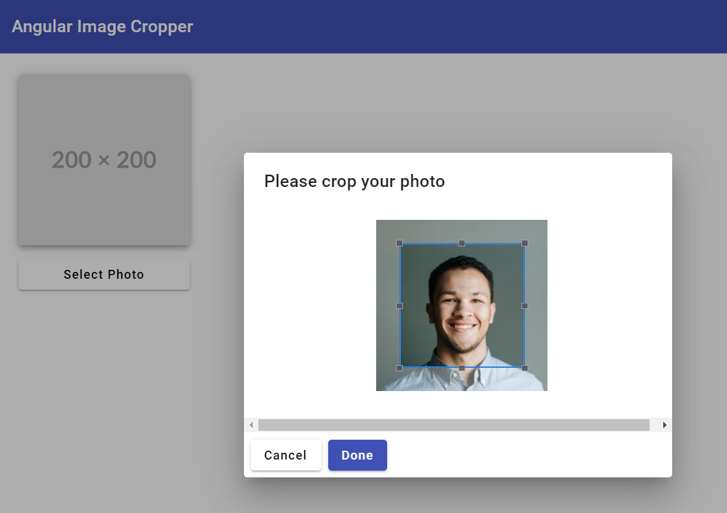
Adding Cropper Dialog UI
After defining the data, we start by adding a title with the directive mat-dialog-title. Then we specify the contents of the dialog by creating a div with the mat-dialog-content directive and the Image Cropper component. Also, we add the action buttons at the bottom.
<h1 mat-dialog-title>Please crop your photo</h1>

<div mat-dialog-content>
  <!-- Image cropper will go here -->
</div>

<div mat-dialog-actions>
  <button mat-raised-button [mat-dialog-close]="false">Cancel</button>
  <button mat-raised-button color="primary" [mat-dialog-close]="result()">
    Done
  </button>
</div>
The cancel button will simply close the dialog with a false value. The Done button will send the result signal we defined that contains the last selected crop of the image. Notice how conveniently we use the mat-dialog-close directive which is shorthand way of closing the dialog.
Adding the Ngx Image Cropper
Now let's add the ngx-image-cropper to the dialog content and give in the following inputs to it.
<div mat-dialog-content>
  <image-cropper
    [imageFile]="data.image"
    [maintainAspectRatio]="true"
    [aspectRatio]="data.width / data.height"
    [resizeToHeight]="data.height"
    [resizeToWidth]="data.width"
    (imageCropped)="imageCropped($event)"
  >
  </image-cropper>
</div>
We're sending in the image file and specifying the aspect ratio that we want the cropper to maintain by using the dimensions we get from the dialog's data.
Note also the use of resizeToHeight and resizeToWidth inputs: these ensure that the output will be resized to the specific dimensions even if the user selects a very large sized photo e.g. from their phone camera.
For more inputs and options available for the
ngx-image-cropper, you may refer to the official docs for the package here.
When crops are made on the image, the imageCropped event lets us save the new result each time a modification occurs. This event handler is called multiple times when the crop box is adjusted.
All we do in the handler is check for valid blob and then set the value to the result signal.
imageCropped(event: ImageCroppedEvent) {
  const { blob, objectUrl } = event;
  if (blob && objectUrl) {
    this.result.set({ blob, imageUrl: objectUrl });
  }
}
Great, we're all done with the Cropper Dialog now. But we need to add file selection functionality to the image control. So let's go back and do that now.
Adding File Selection to Image Control
The first thing we do here is add a hidden file input field, from where our image would be selected. This input field is hidden because we want our users to interact with the ‘Select Photo’ button instead, creating a more pleasant user experience.
We then trigger the click of the input field on button click referring to the input field with a template variable inputField.
<input
  #inputField
  type="file"
  hidden
  (change)="fileSelected($event)"
  (click)="inputField.value = ''"
/>
<button mat-raised-button (click)="inputField.click()">Select Photo</button>
We add two event handlers to the input field. The first is the change event called fileSelected(), which is triggered when a file is selected for upload. The second is an added click event that clears the value every time the input field is clicked.
This is meant to prevent a bug which I discovered during testing - when selecting the same file multiple times.
Opening the cropper dialog
After a file is selected, we need to show the Cropper Dialog component after checking that the selected file is valid. To do this, we first inject MatDialog in the component and subsequently open the Cropper Dialog.
Note: Please also ensure the
MatDialogModuleis included in the imports of the component for the dialog to work
dialog = inject(MatDialog);

fileSelected(event: any) {
  const file = event.target.files[0];
  if (file) {
    const dialogRef = this.dialog.open(CropperDialogComponent, {
      data: {
        image: file,
        width: this.imageWidth(),
        height: this.imageHeight(),
      },
      width: '500px',
    });

    ...
  }
}
As you can see, we send in the file and the dimensions in the data for the dialog and keep a reference to the dialogRef so we can handle it when its closed.
Let's see how we do that next!
croppedImage = signal<CropperDialogResult | undefined>(undefined);

dialogRef
  .afterClosed()
  .pipe(filter((result) => !!result))
  .subscribe((result) => {
    this.croppedImage.set(result);
  });
So where do we keep the result? We create a new signal for the purpose. Then we listen to the dialogRef afterClosed function and filter on the result being truthy. This means when we subscribe to the RxJS stream, it'll only run when a valid image result is returned.
Then, we simply set the value of the result in croppedImage signal.
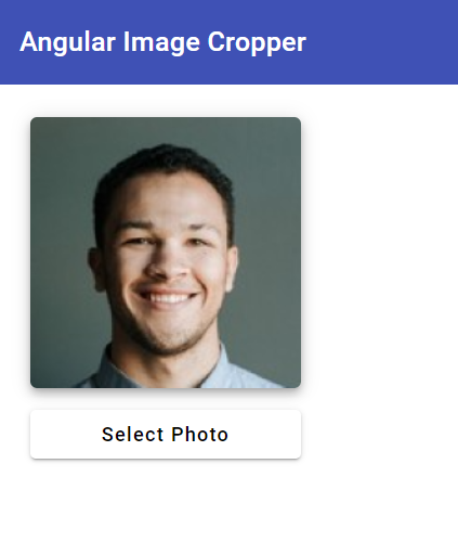
Updating the image source of the control
We have just one last thing that we need to do. And that is update the image source in the image control component - because currently it only shows the placeholder all the time.
Let's create a new computed signal called imageSource and add the following logic to it.
placeholder = computed(
  () => `https://placehold.co/${this.imageWidth()}x${this.imageHeight()}`
);

croppedImage = signal<CropperDialogResult | undefined>(undefined);

imageSource = computed(() => {
  if (this.croppedImage()) {
    return this.croppedImage()?.imageUrl;
  }

  return this.placeholder();
});
So basically we just want to show the placeholder when we don't have any croppedImage available. But if we do, we want to show that instead using its imageUrl.
You can see now the power of signals and the reactivity it brings to Angular out of the box!
Ok, let's test this out now finally.
Finishing touches
Once the user is happy with the crop, the blob for that image should be sent back to the parent component and can then be uploaded to the server. To do that, we need to add an output called imageReady to the Image Control component for the function of sending the cropped image back to the parent component.
We can do that easily in an effect like this.
@Output() imageReady = new EventEmitter<Blob>();

constructor() {
  effect(() => {
    if (this.croppedImage()) {
      this.imageReady.emit(this.croppedImage()?.blob);
    }
  });
}
So whenever the croppedImage signal's value changes, the output is emitted with it's blob and can be handled in the parent component as a normal component output can be.
Wrapping Up
And that's it! You've now created a reusable image cropper component in Angular. This component can automatically generate placeholders based on the input dimensions, allow users to select photos, crop them to retain the correct aspect ratio, and send the correctly sized photos back to the parent so you can upload to the server.
I hope you enjoyed this tutorial. Feel free to play around with and improve the code available here on github. In the next part of this tutorial, we'll explore how you can automatically upload this image to a server (like Firebase Storage) and get a URL back in return!
Stay tuned for more such tutorials. Happy Coding!
Check out my Angular and Firebase Authentication crash course

Use Angular 16, Angular Material and Firebase Authentication, Firestore and Storage to create a complete Sign Up App!
You may also like...


Learn Angular and Firebase!
Use Angular 16, Angular Material and Firebase Authentication, Firestore and Storage to create a complete Sign Up App!